
B2B Supply Chain Finance App
Transformed complex B2B data into human experiences, aligning user needs with business impact.
Role
Calculum
Company
UX/UI Designer
Overview
Calculum provides a web platform that help companies to stay competitive in an increasingly complex financial landscape.
My role was ensuring intuitive, and scalable design framework.
Procurement teams need to make fast decisions, but complex financial platforms slow them down. When data is scattered across dense tables and workflows are clunky, professionals can't quickly spot the insights they need. This means missing opportunities to negotiate better terms and optimize what should be strategic wins.
The Problem

Journey Map: Optimizing Terms
Prioritize Critical Insights
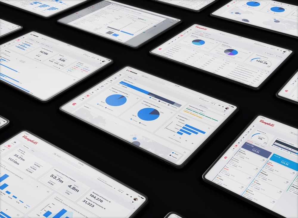
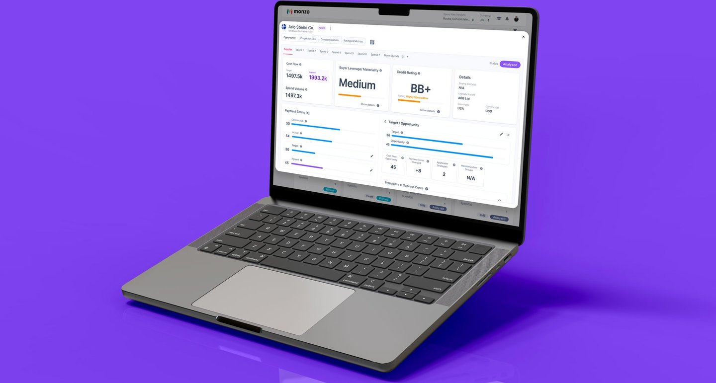
Challenge 01: Dashboard Redesign
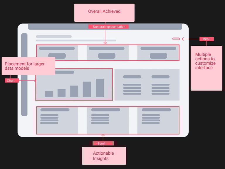
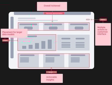
Content Architecture
Map out context to see the full picture. Bring the whole data story together instead of piecing it from scattered fragments.
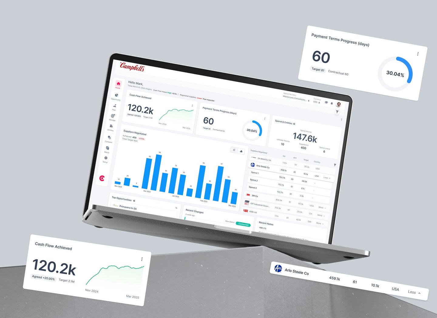


A strong hierarchy and thoughtful layout enable instant, at-a-glance insights by minimizing visual clutter and leveraging color and contrast, resulting in improved chart readability for data-heavy dashboards.
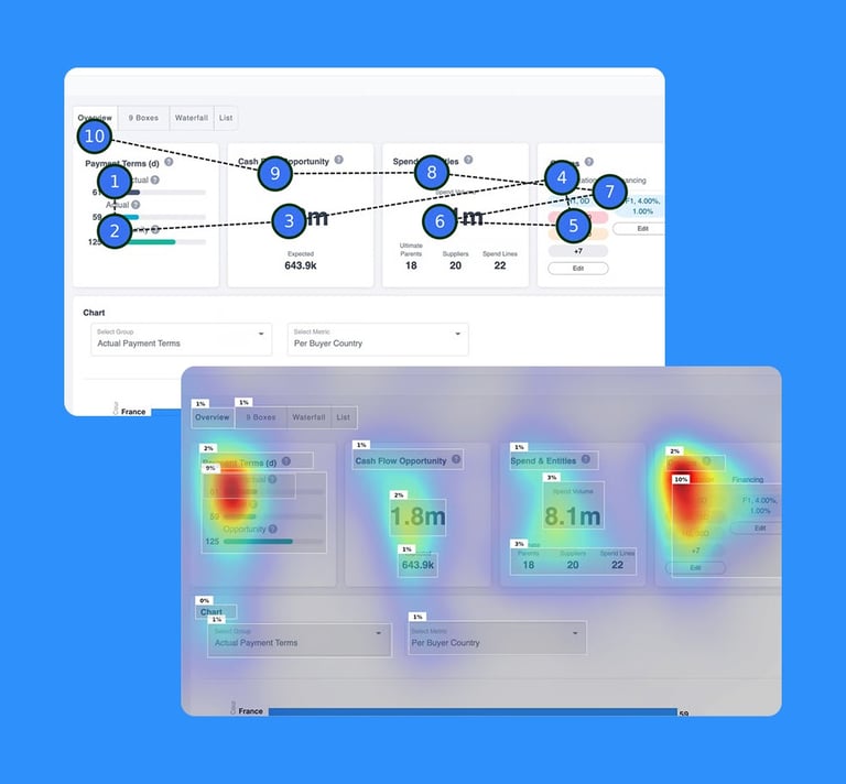
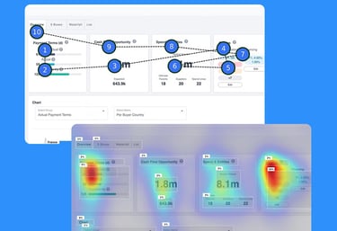
Takeaway: Heatmaps and gaze point of the new simplified layout to support effective scanning.
Optimize Insights and Layout Hierarchy
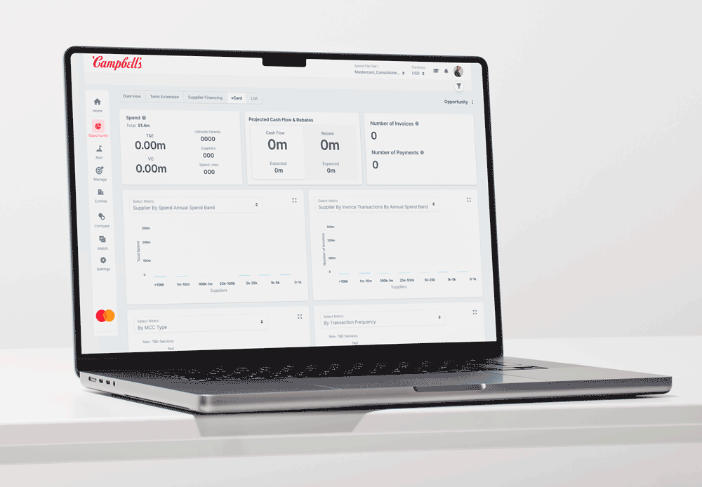
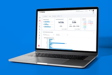
Challenge 02: Analyzing Opportunities
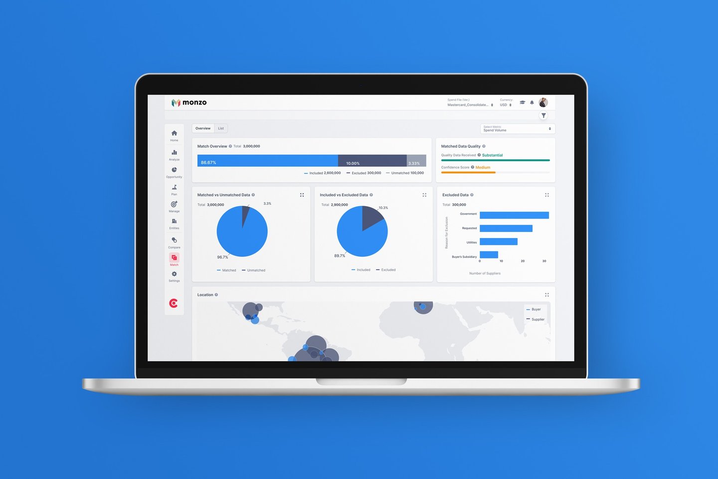

Clear visual hierarchy now guides users through their workflow, while accessible charts support decision-making without overwhelming the interface.

Implement Track & Adjustments
Challenge 04
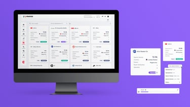
Showing only what users need at each step. Clear visual hierarchy guides users naturally through their workflow, while secondary actions stay hidden until relevant. This reduces cognitive load and helps users focus on making decisions, not managing interface complexity
Ease Access To Past Adjustments
Takeaway
Through research-driven design improvements, procurement teams can now find critical insights 40% faster and complete key tasks with fewer clicks. The streamlined interface reduced user errors by 60% while increasing daily platform engagement. Most importantly, professionals report feeling confident navigating complex financial data - turning what used to be a frustrating experience into a strategic advantage.